Hallyu Magazine
PUBLICATION DESIGN | TYPOGRAPHY
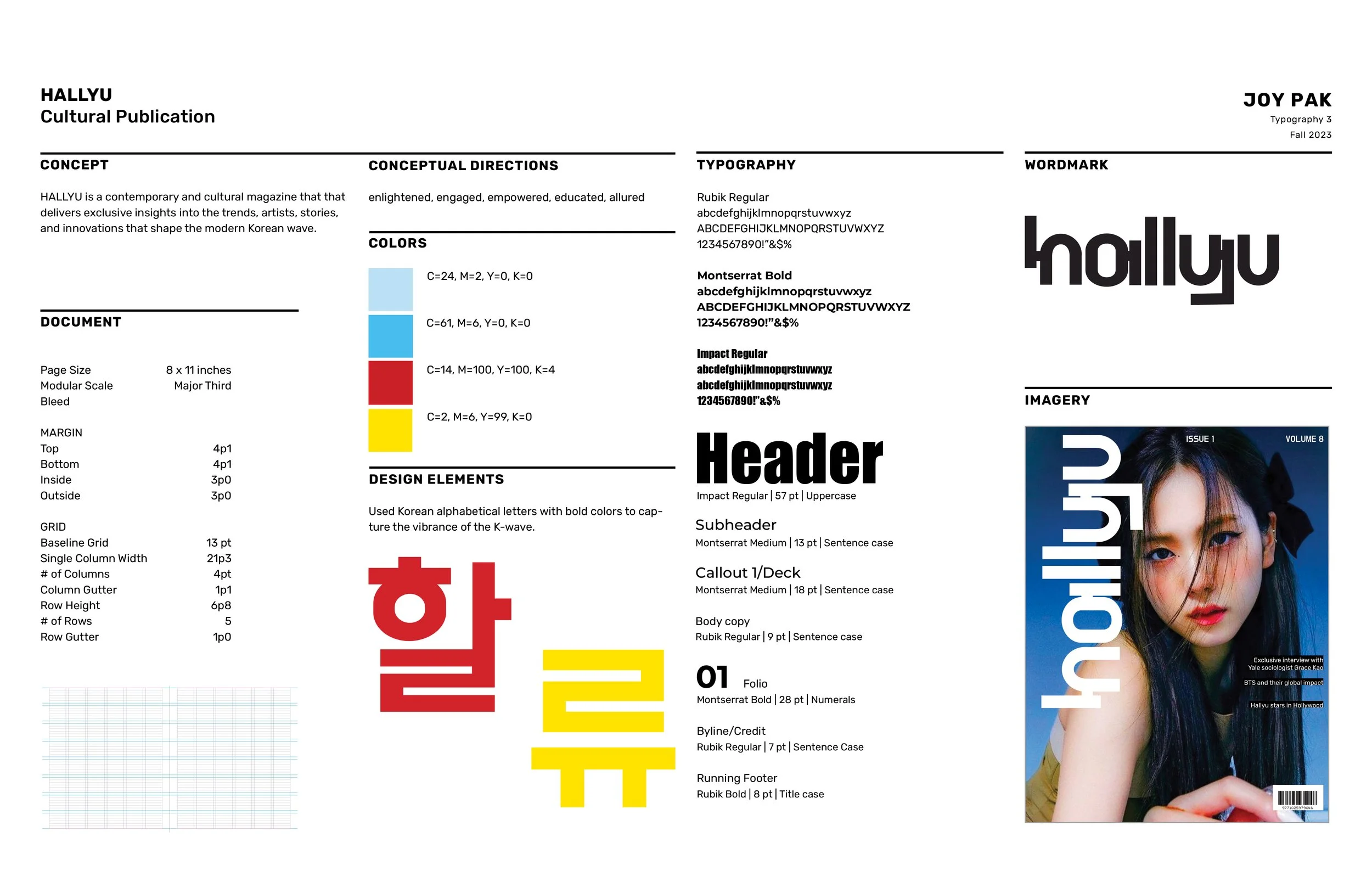
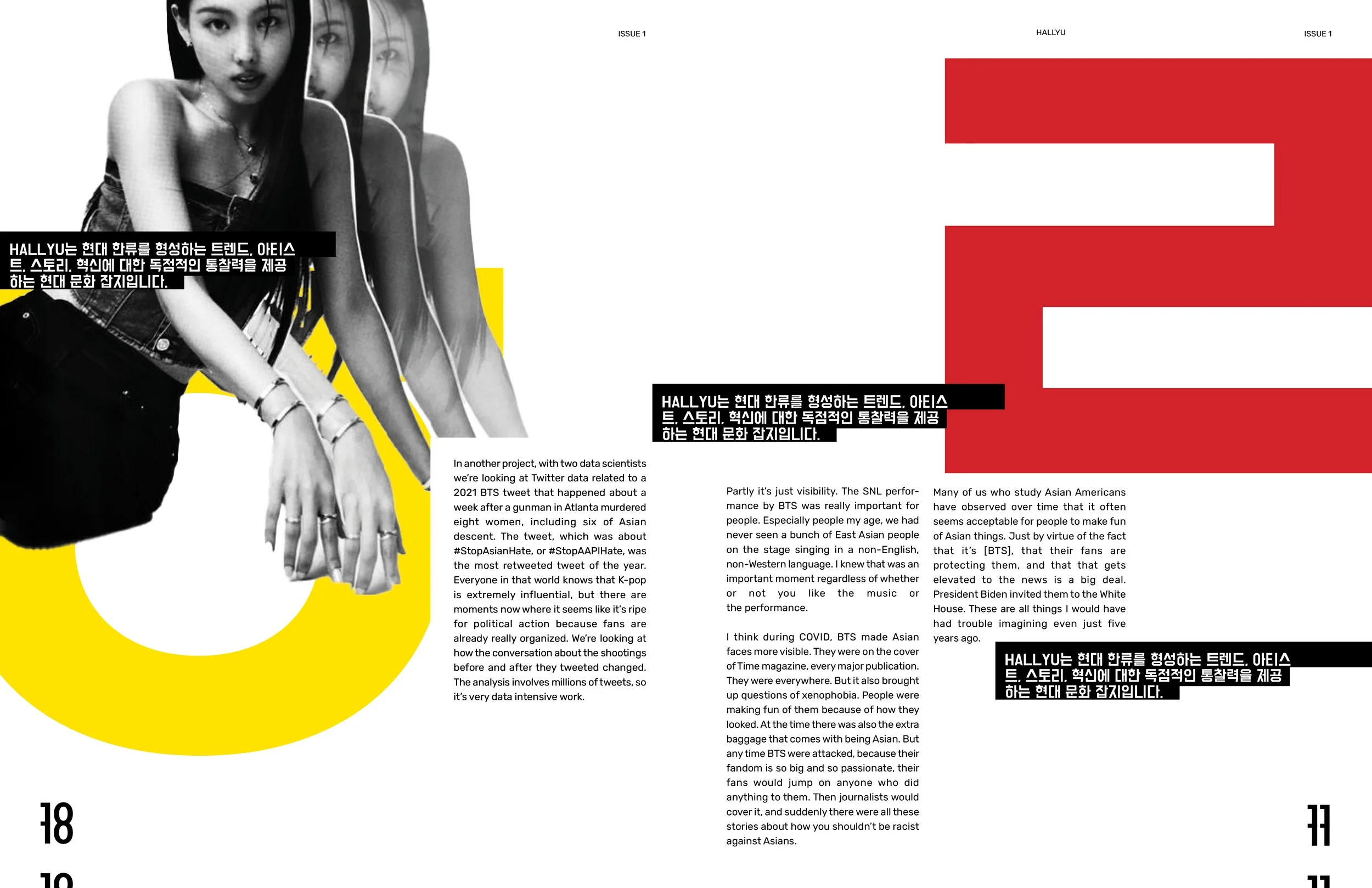
HALLYU is a fictional contemporary and cultural publication that delivers exclusive insights into the trends, artists, stories, and innovations that shape the modern Korean wave. The objective of this project was to create a conceptual magazine using typographic attributes to capture the essence of its theme.
Initial Sketches
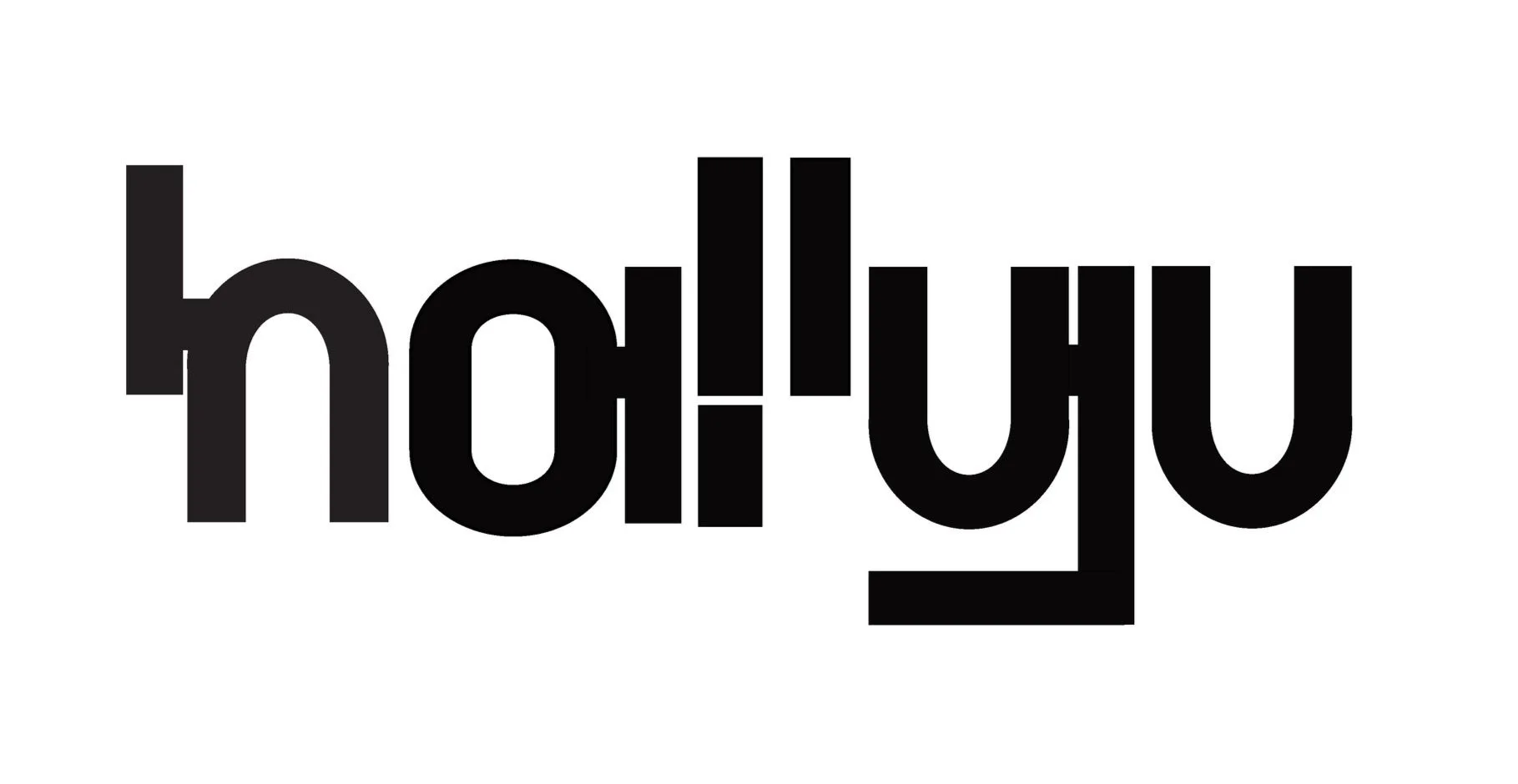
I began my design process by exploring different typefaces and sketching different variations of the typefaces to create a distinctive wordmark. I wanted to integrate the Korean alphabet into my wordmark in some way, so I began experimenting by selecting Korean alphabet characters that have a visually appealing shape and modifying them to create a cohesive and visually appealing design.

Digital Iterations
After developing a series of sketches, I began to create multiple iterations using typographic characteristics that expressed the contemporary feel that tied along with the overall theme of the magazine. Throughout my design process, I received feedback from my peers from in-studio critiques that ultimately led me to narrow down to my final composition.
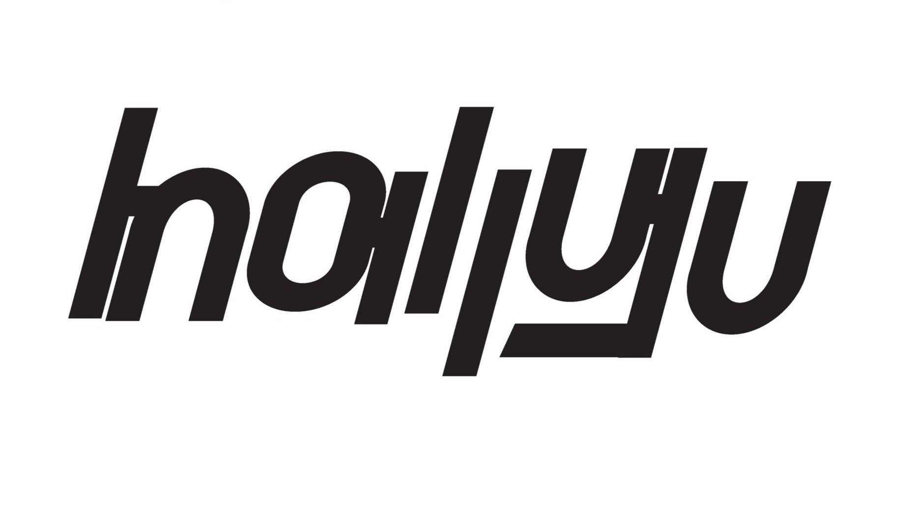

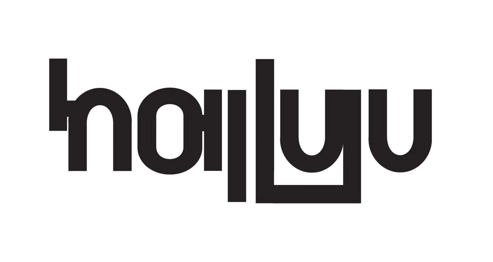

Final Wordmark
Process GIF
Visual System


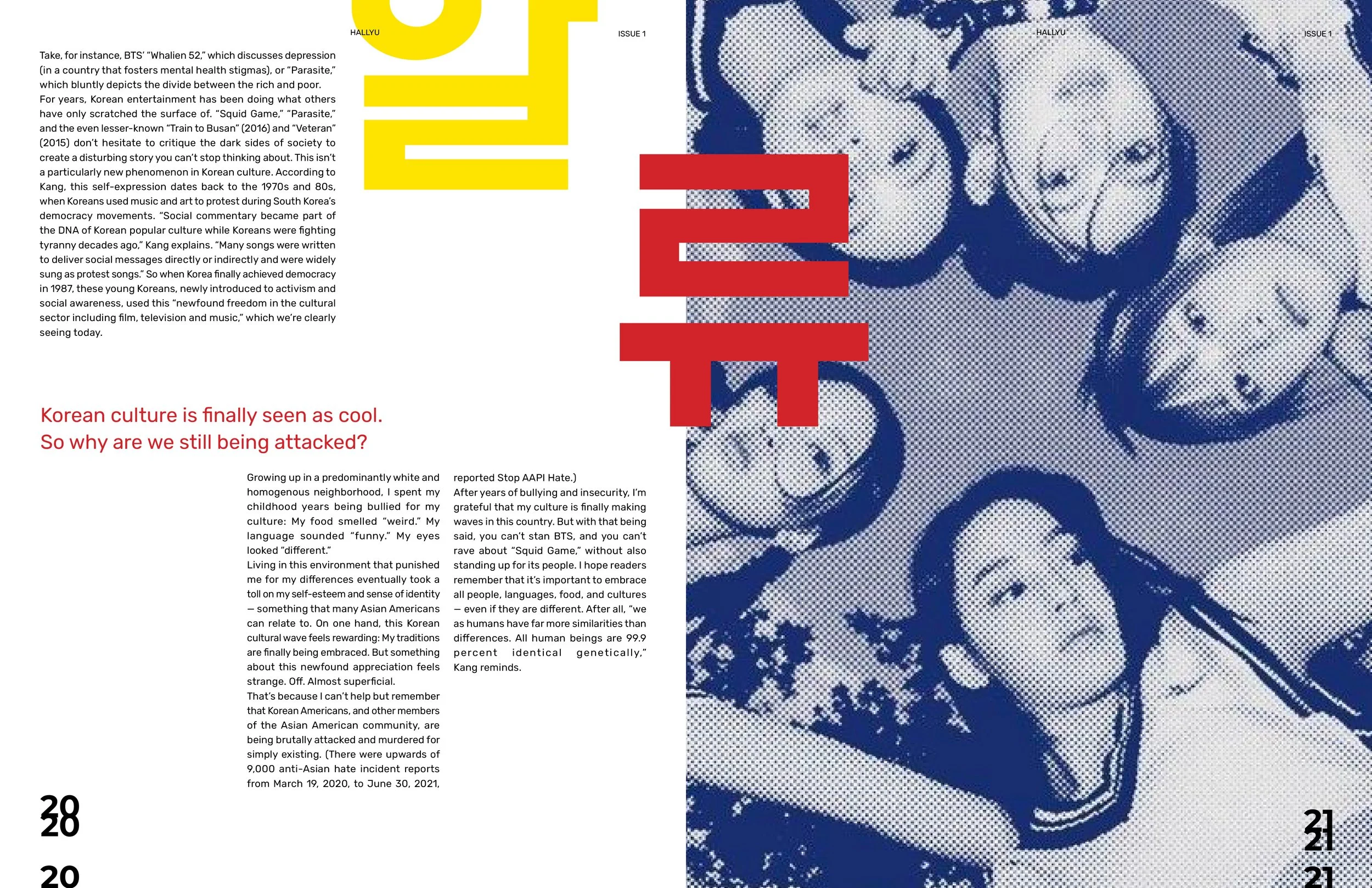


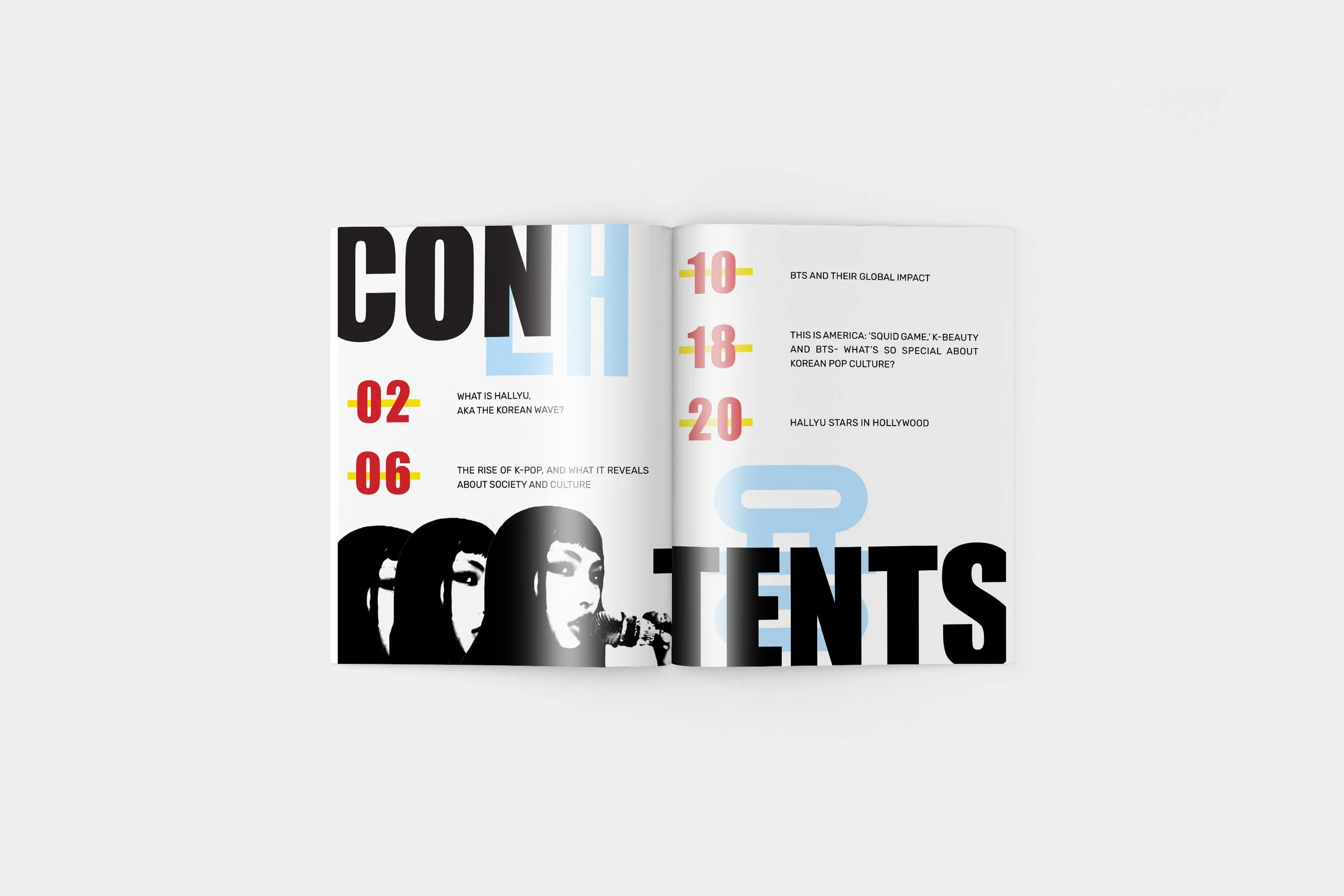
Korean pop culture is vibrant and dynamic, and I aimed to capture this energy in my magazine through the use of bold colors and imagery. To further reflect the essence of Hallyu, I incorporated Korean letterforms throughout the magazine, using bold, colorful characters to emphasize the vibrance of K-culture.


Layout Explorations

Final Design