Craigslist Redesign
GROUP PROJECT | UX/UI DESIGN
In collaboration with Elliot Myers and Shikha Chatterjee
This project focused on analyzing Craigslist’s existing website to identify areas for improvement and proposing a redesign that enhances usability and user experience. Our overarching goal was to optimize key tasks like housing searches and job postings through a more intuitive and visually appealing design.
Usability Testing
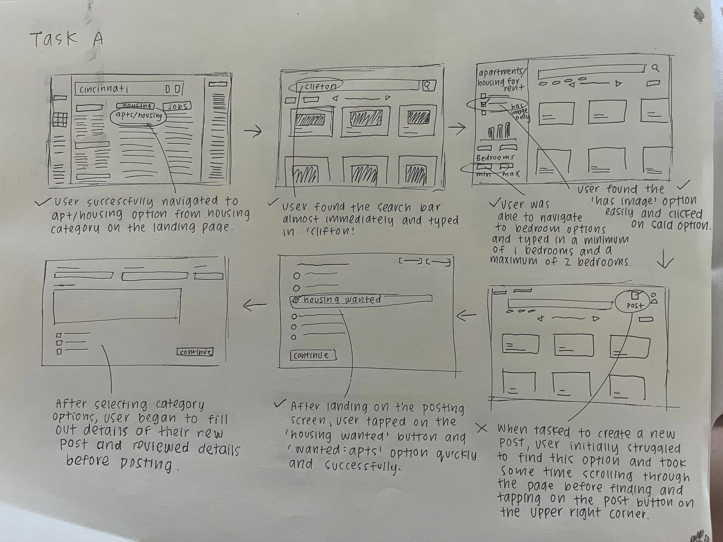
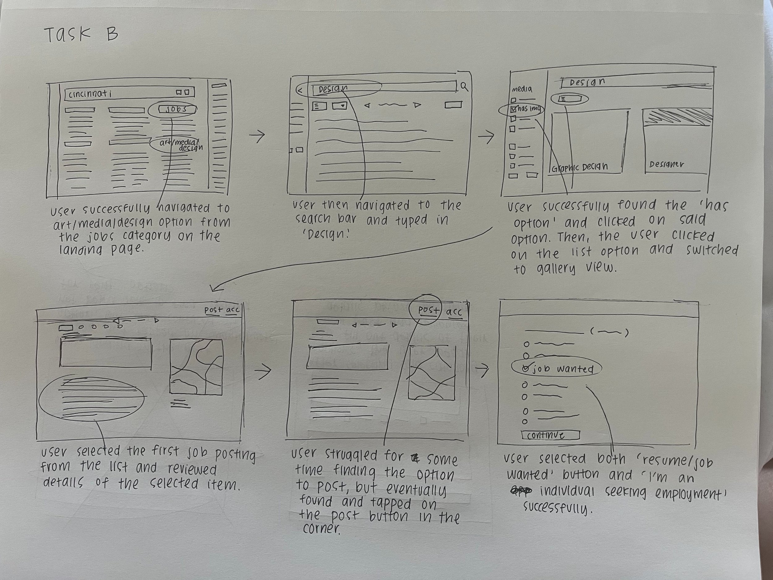
We started our design process by conducting usability tests with two different task flows based on the existing site structure, identifying key user pain points and opportunities for redesign(Task A, find housing options in Clifton) (Task B, find job postings in Cincinnati, OH). We decided to prioritize our focus on Task Set A, which involved navigating Craigslist to search for housing in Clifton.
Existing App Audit/Design Proposal
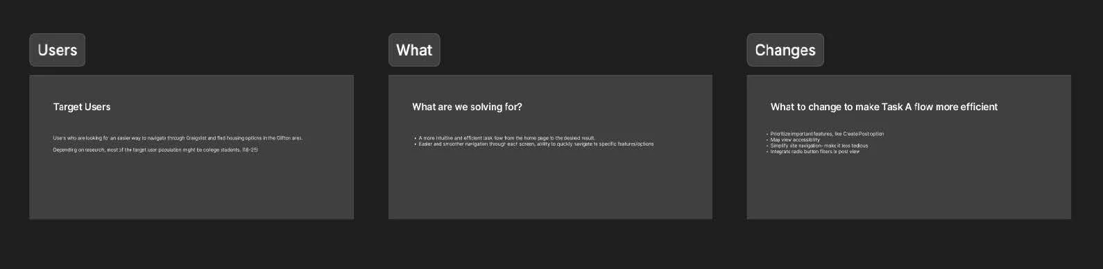

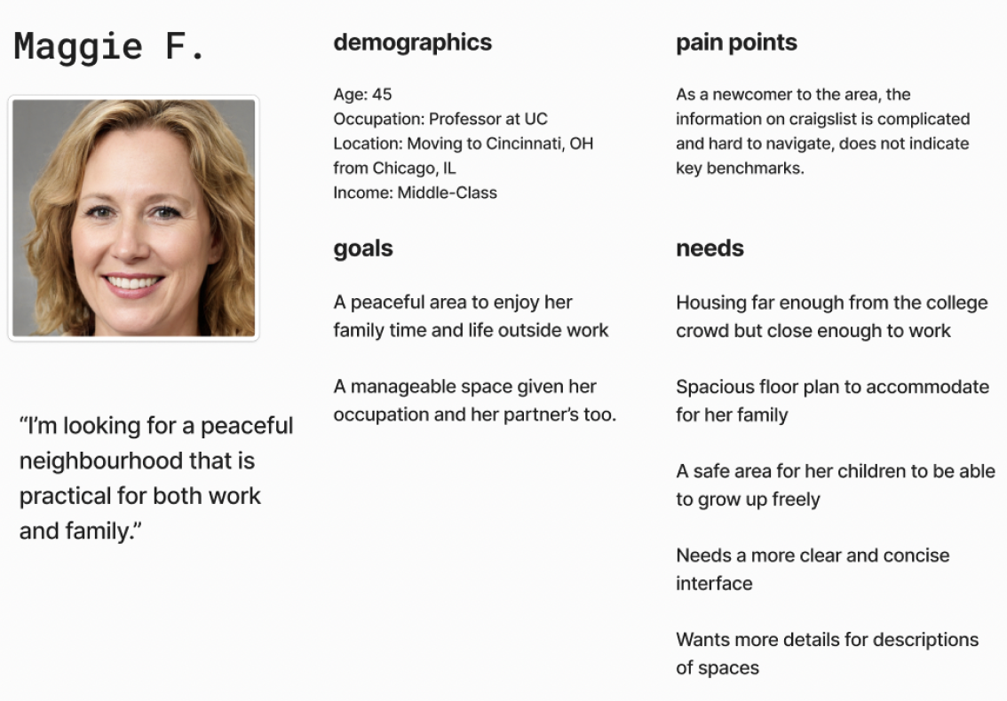
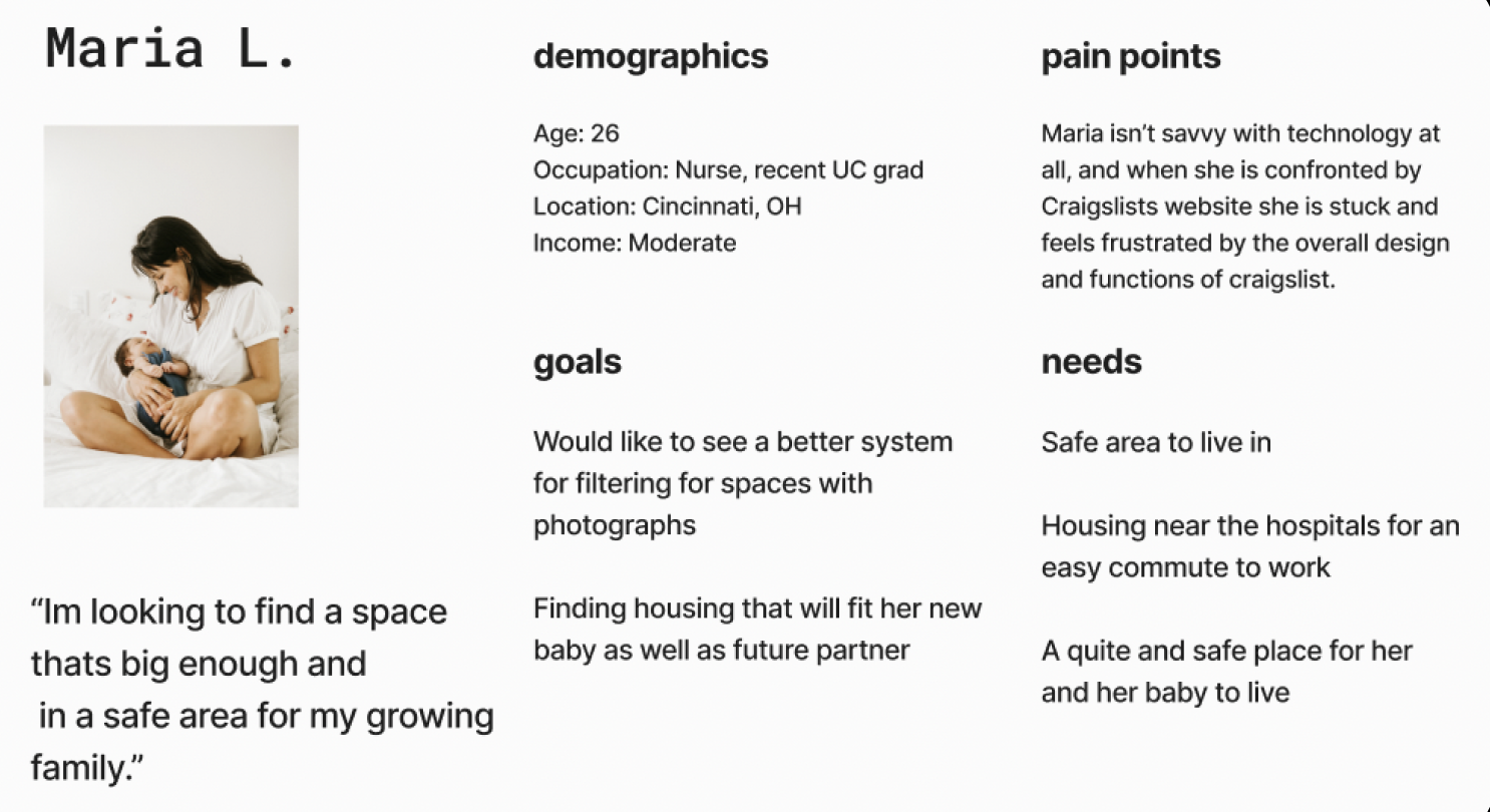
We defined distinct personas based on our proposal and to represent typical users of the site, providing a clear understanding of who we are designing for and their specific needs.
Our main goal was to redesign the site to improve task flow by simplifying navigation and making it more intuitive. We aimed to help users quickly access key features and options, addressing the current issues with the site's complex and confusing navigation. We defined our target users, identified pain points, and pinpointed the necessary changes to enhance the overall flow.
Defining User Personas


Identifying Task Flows/Lo-Fi Wireframes
Revised Information Architecture
We developed a revised information architecture with an emphasis on streamlining user navigation by implementing a simplified navigation bar, enhancing search filters, prioritizing key features like the 'Create Post' option, and establishing a clearer informational hierarchy for a more intuitive browsing experience.


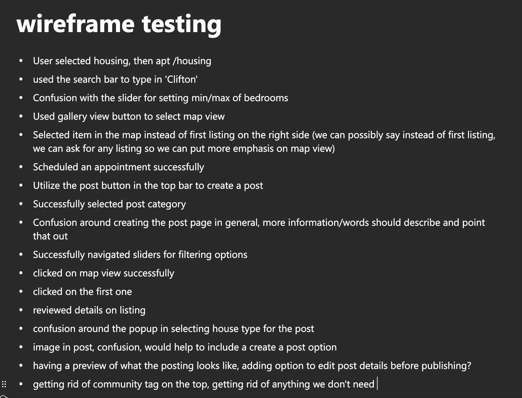
Based on our user personas, goals, and initial sketches, we developed digital wireframes in Figma for user testing. Through prototyping and observation, we gathered valuable insights on how users navigated the revised flow. Key takeaways included refining the search tab and filter options for better cohesion and eliminating unnecessary steps to streamline the task flow.
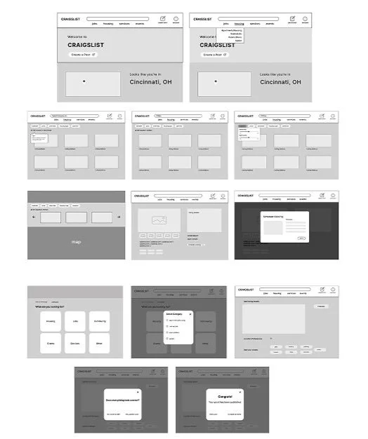
After finalizing our task flow and site redesign mappings, we began conceptualizing our ideas through sketching low-fidelity wireframes. This process allowed us to visualize the flow between screens and gain a clearer sense of how the redesign would take shape.

Digital Wireframes/Testing
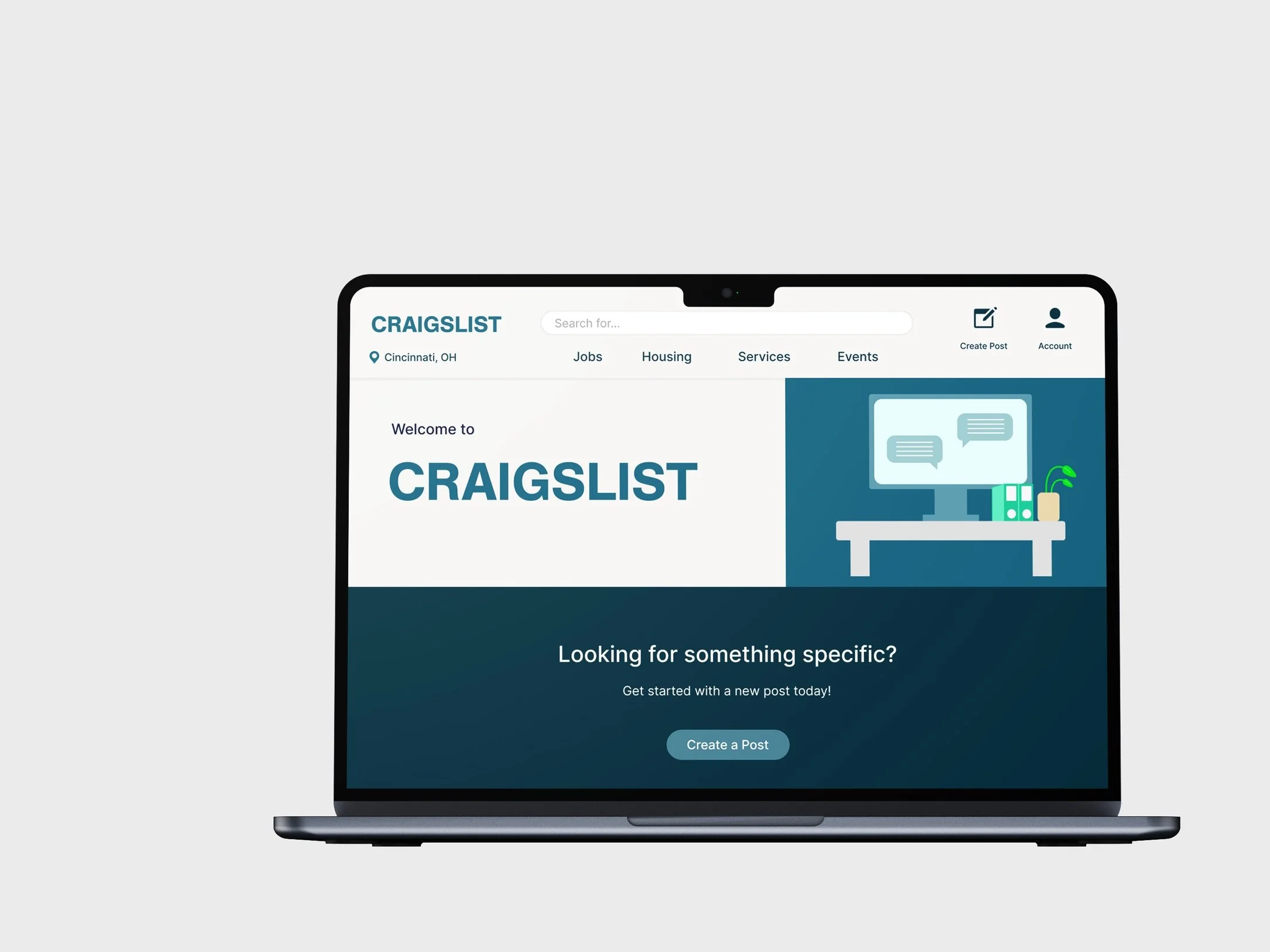
As we refined our low-fidelity wireframes in Figma, we established a solid layout and screen flow, allowing us to explore visual styles for the redesign. Each team member researched inspiring websites, compiling a mood board to guide our design direction. Our group then developed a Style Guide to define key visual elements, including iconography, buttons, typography, tooltips, and colors. We kept the palette minimal for cohesion, choosing colors that convey trust and dependability while maintaining a clean design. Familiar icons and buttons were incorporated for intuitive navigation.

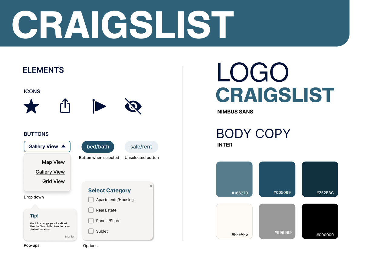
Moodboard/Style Guide

We refined our screens using elements from the Style Guide to maintain a cohesive design and finalize our screens. As we finalized our digital mockups, we used Figma’s prototyping tools to create an interactive prototype that guided users through the entire task flow.

